Building Cambiotics’ Web Platform and Digital Identity
Read how we designed a scalable e-commerce site to support Cambiotics’ product launch.
01.
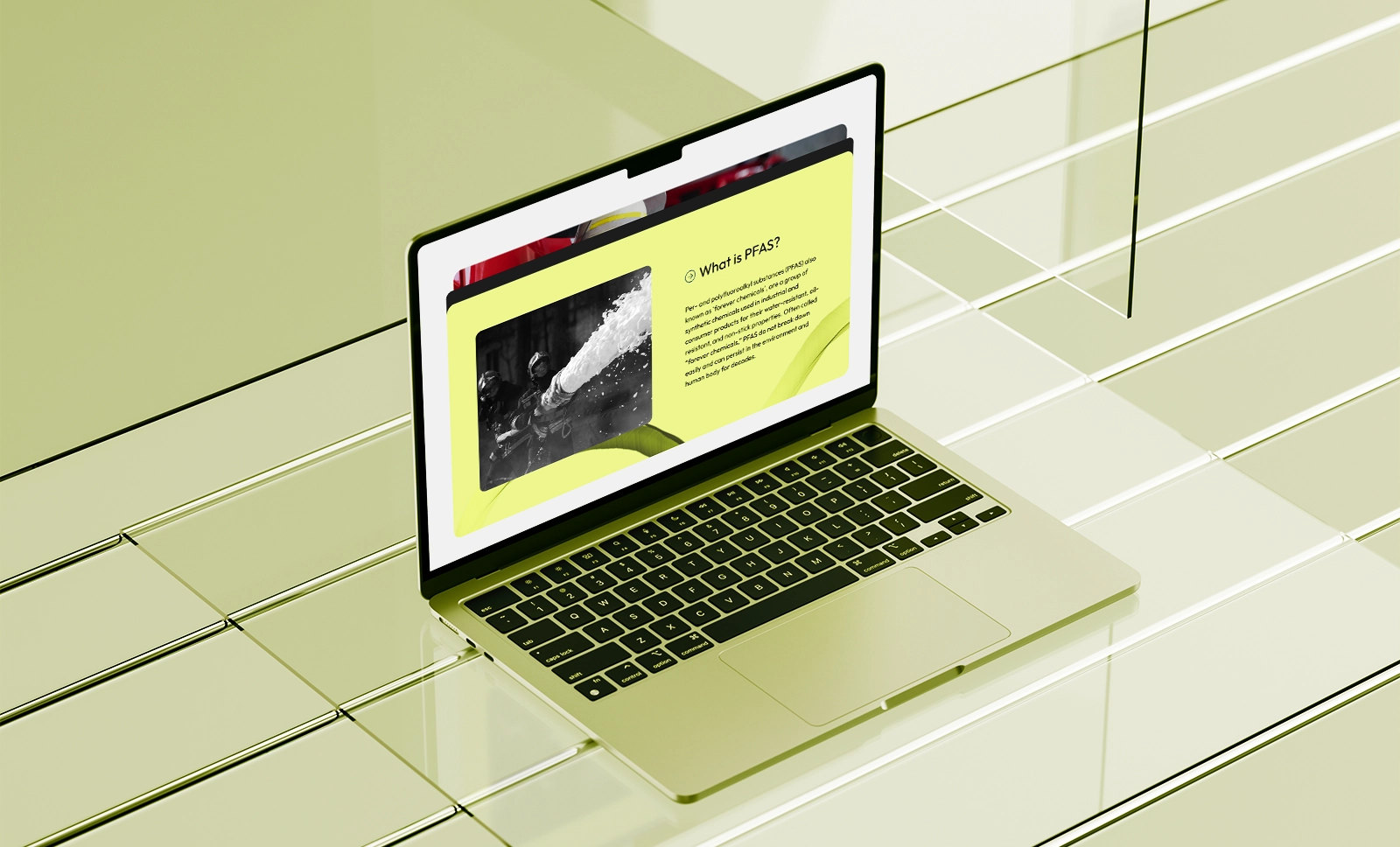
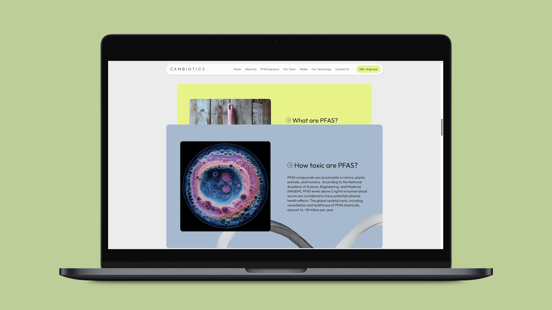
Fighting the invisible threat
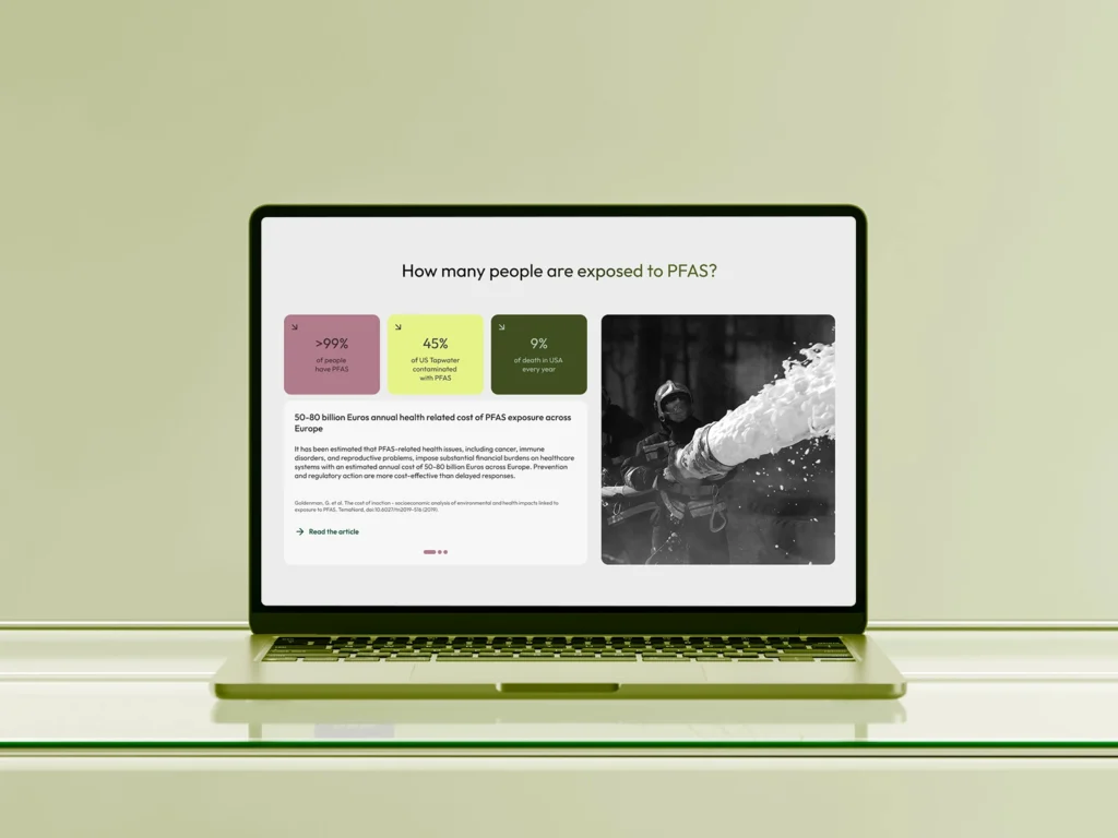
PFAS (a large group of synthetic chemicals) are found in 99% of people’s blood and linked to cancers, thyroid disease, and immune dysfunction.
Founded in 2024 at the BioInnovation Institute in Copenhagen, Cambiotics is developing a probiotic to remove these “forever chemicals” from the body.
As Cambiotics prepared to launch its first product, the urgency around PFAS made their mission more relevant than ever
How we helped Cambiotics get launch-ready
A new website was central to their go-to-market strategy, providing both a clear brand identity and an e-commerce platform.
Cambiotics asked us to design and build a WordPress site that could do both. The website marked an important step in helping with their first product launch.
Together, we:
Built a visual system from Cambiotics’ early brand cues
Mapped a user journey aligned with business goals
Developed a WordPress + WooCommerce e-commerce platform
Trained the Cambiotics team to manage content independently
Cambiotics came to us with a logo, product design, and early ideas for their site. Our role was to turn these into a clear brand identity.
Through workshops and interviews, we worked with the team to define:
Who the site should speak to From high-exposure groups like firefighters to health-conscious consumers.
What tone should it set Premium and credible, while keeping a human touch.
How it should support growth Aligning homepage priorities with Cambiotics’ 12-month business objectives and e-commerce plans.
The result was a website that expressed Cambiotics’ mission in a way that felt clear, authentic, and approachable.
Built around Accessibility
Accessibility was part of the project from day one. Our goal was to make the site usable for everyone, simple to read & navigate.
Color and contrast: palette tested to meet WCAG standards.
Clear content: headings, short blocks, and scannable sections.
Flexible layouts: carousels and modules to keep pages light but informative.
Compliance checks: reviewed against WCAG and SAC standards throughout.
By designing this way, we helped Cambiotics reach a wider audience. Discover more about our
accessibility services.
03.
Creating the look and feel for launch
To prepare for launch, we worked with Cambiotics to turn their early brand cues into a complete visual identity. Together we defined the palette, typography, imagery, and patterns that gave the brand its look and feel.
Color palette
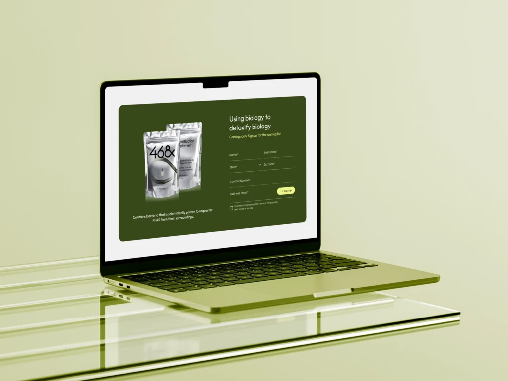
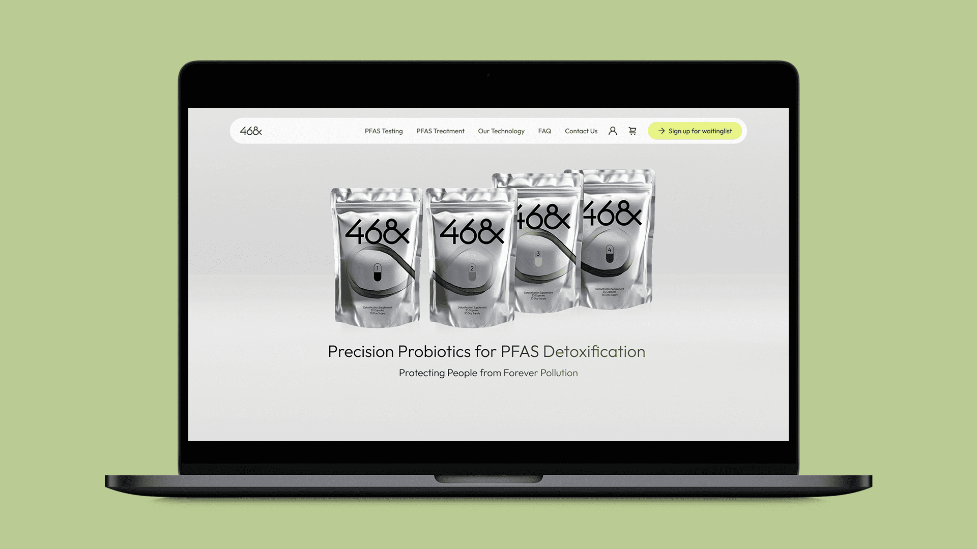
The palette started with Cambiotics’ packaging: metallic greys with color accents on the capsule.
We translated this into neutral tones and added green to connect the brand to biology. Colors were chosen to show trust, safety, and optimism.
Typography
Typography matched the packaging design for consistency across product and website. This created instant recognisability.
The type system used large headlines for impact, clean body text for credibility, and strong contrast for accessibility.
Imagery
We combined two styles of imagery:
Abstract forms Black-and-white shapes inspired by bacteria and cells.
Real life Firefighters, veterans, and everyday people in hero and background imagery.
This balance connected science with human stories and reflected the audiences most at risk of PFAS exposure.
Iconography & patterns
The client’s “eternity” symbol was hard to use at scale. We turned it into a micro-pattern used in dividers, bullet icons, and scroll cues. This kept the motif present without overwhelming the layout.
04.
Motion and interaction
Motion played a key role in making the site feel alive without distracting from the content. We used GSAP to create small, purposeful effects that guide the user through the experience.
Background shifts Section backgrounds changed color as users scrolled. This gave a clear signal of entering a new section and added rhythm to long pages.
Carousels Scientific details were placed in carousels within the page. This kept pages short while letting users explore more without losing their place.
Micro-animations Small transitions were applied to icons, buttons, and hover states. They gave users feedback and made the interface feel smooth and responsive.
This created a site that feels modern but also approachable.
05.
Building the e-commerce foundation
The website had to support Cambiotics’ upcoming product launch with a reliable e-commerce platform.
Platform choice WordPress + WooCommerce for a budget-friendly, scalable, and fast-to-market solution.
Custom features Subscription-ready profiles, flexible product pages, and CMS tools tailored for content updates.
Optimization Webpack setup for faster load times, mobile performance tuning, and security basics.
After launch, we provided CMS training so the Cambiotics team could edit pages, update content, and manage products on their own. This reduced reliance on developers for day-to-day tasks.
06.
Summary
Cambiotics faced the challenge of bringing their first product to market. The new e-commerce site was built to support that launch. We partnered with their team to create a platform that brought brand, design, and sales together. The result gives Cambiotics the tools to launch now and a foundation to grow from.
Interested in launching your product to market? Get in touch to see how we can help.