We delivered the new UI within 1.5 months and under budget, in time for an investor presentation that allowed the customer to secure €7.2M in funding.
Customer needs
UZE provides a marketplace for mobile digital outdoor advertising. Their system is based on a complex AI that combines information involving geo-targeting, IOT, micro-targeting, and even traffic and weather, to allow their clients to get the best value out of their adverts. What UZE needed us to do, was to create an intuitive User Interface that would allow their clients (who are marketers, not programmers) to easily navigate all the available options, take advantage of what their AI had to offer, and monitor the results of their advertising campaigns.
03.
The obstacles
The main problem naturally stemmed from UZE’s main advantage: their AI-driven software is complex and offers huge possibilities, but how to cram all this potential into a UI that a normal person will understand and find easy to use? It was also challenging but crucial for our team to understand UZE’s somewhat complicated business model, which is an innovative mix of a modern marketplace and traditional outdoor advertising.
An additional challenge with any start-up is the dynamic and ever-changing nature of their business – this required us to be agile and provide for future updates. We were also pressed for time, because of the upcoming investor meeting, and forced to labour under pandemic restrictions.
04.
The Results
Improved Efficiency in Data Processing
A high performing microservices-based solution that effectively handles a large volume of data for real-life scanning and analysis. This resulted in significantly improved efficiency in data processing, allowing for faster and more accurate results.
Enhanced Usability for Key Functional Panels
Our team designed the solution with a specific focus on usability for the Administration Panel, Client Panel, and Expert Panel. This led to a seamless and intuitive user experience, making it easier for users to navigate and perform their respective tasks within the system.
Optimal Cloud Architecture for Scalability and Reliability
By providing consultancy on the best-fit cloud architecture, our team ensured that the solution was built on a foundation that allows for scalability and reliability. This means the client can efficiently handle increased workloads and maintain a high level of performance even as their data processing needs evolve over time.
Colors:
Primary:
Secondary:
Gradient:
Typography:
Poppins
Bold | Semibold | Regular
Aa Bb Cc Čč Ćć Dd Ee Ff Gg Hh Ii Jj Kk Ll Mm Nn Oo Pp Qq Rr Ss Šš Tt Uu Vv Ww Xx Yy Zz Žž
1234567890०१२३४५६७८९
05.
How did we do it?
First of all, we dedicated a full-time team of front-end engineers, under the supervision of our Delivery Director, focusing entirely on the project. We also cooperated closely with the customer’s back-end developers. We drew on our experience in agile software development. We held biweekly evaluation sessions to redefine our priorities, as well as daily stand-ups to make sure everyone was always on the same page. Because of COVID restrictions, these meetings had to be held remotely, which was a challenge in and of itself that we are happy to have overcome successfully.
Efficient Technology Integration for Rapid Project Redesign
Since UZE had a working application that we had no intention of disturbing. And in view of the upcoming investor meeting, we decided to play it safe and use tested and proven technologies that would ensure correctness and stability. Therefore, we mainly used NestJS for the back-end layer and Angular 11, Akita, Rxjs, and Angular Material for the front-end layer. The first and the most important release of the project, which included UI and business flow redesign took us only 1,5 months, which was very important for our customer’s goals. Not to mention that we fit well under budget.
06.
The outcome
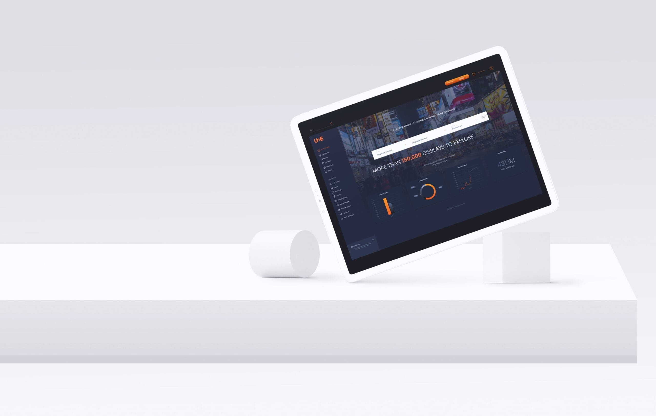
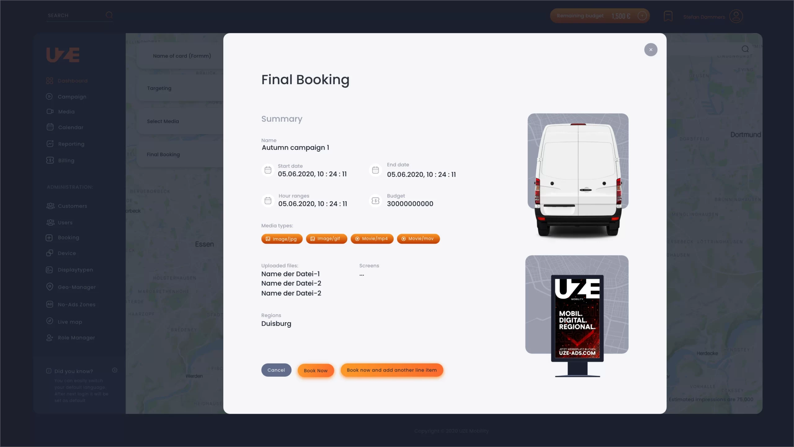
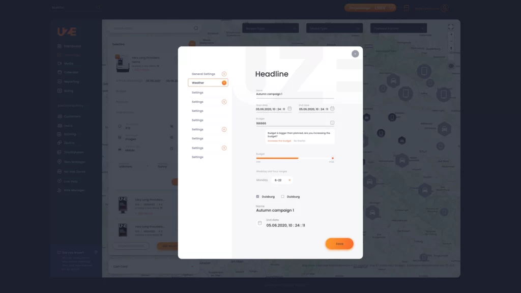
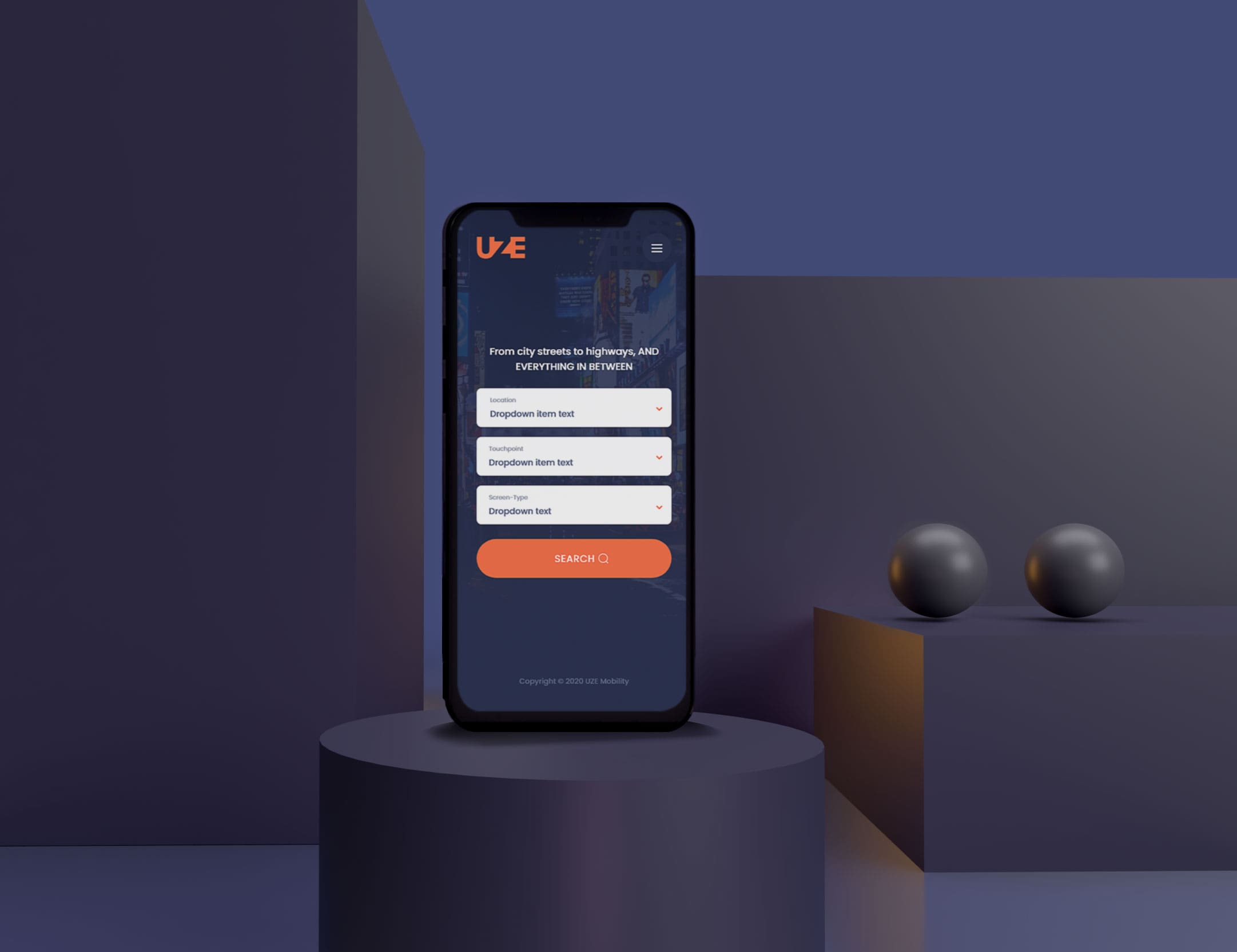
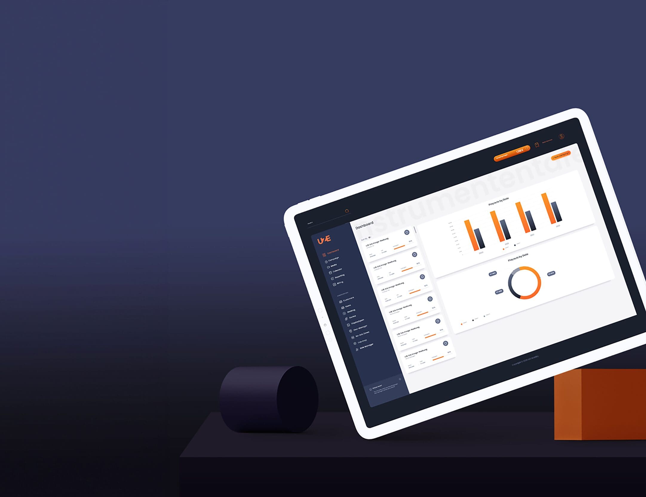
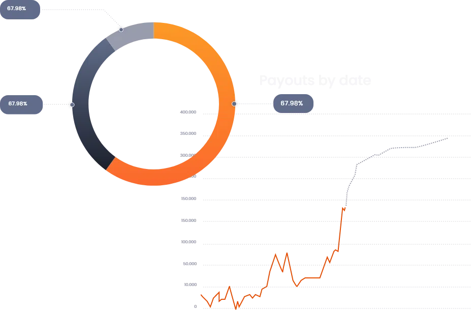
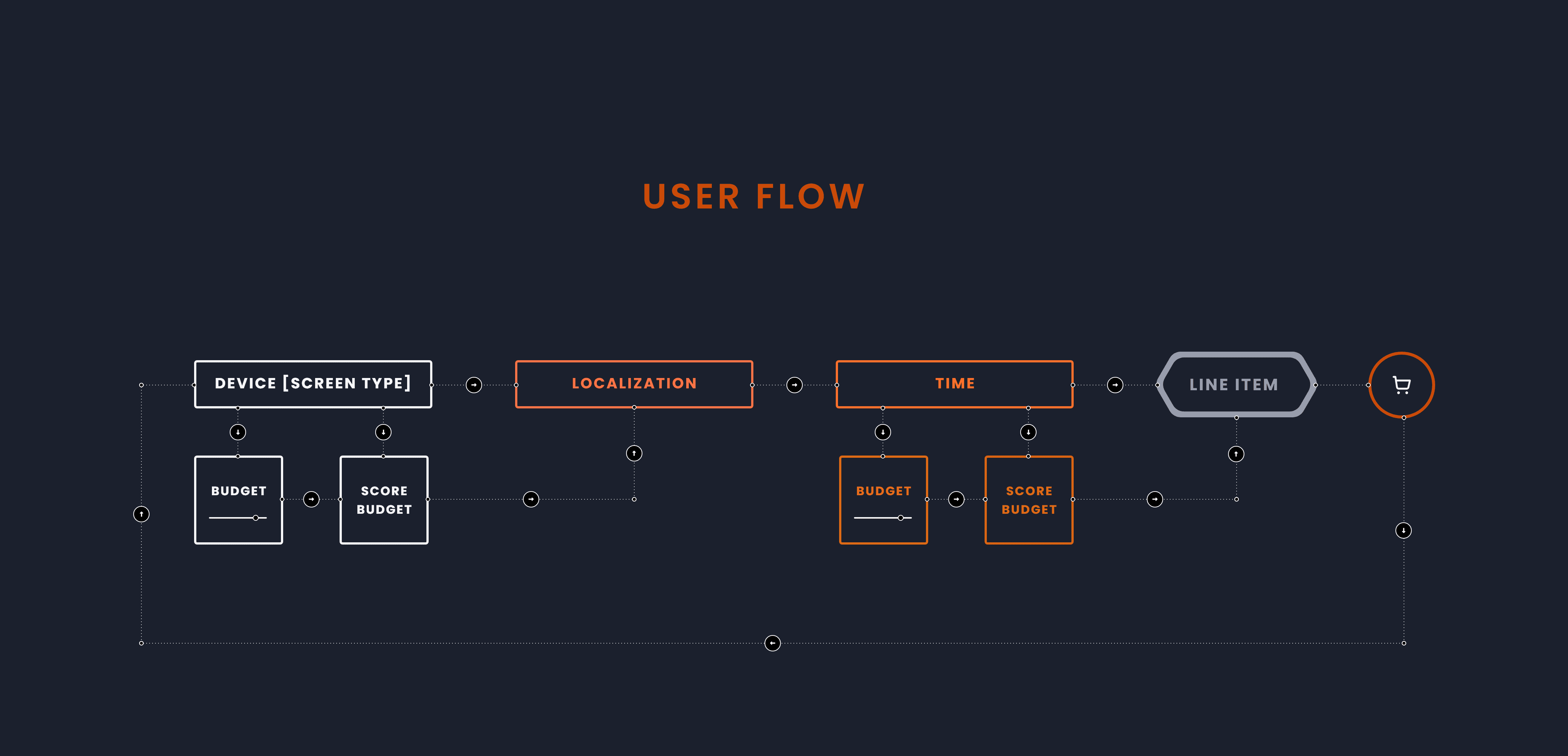
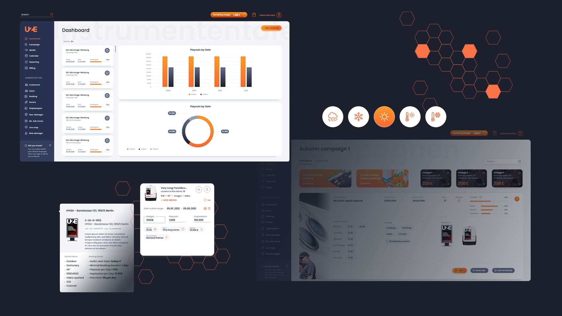
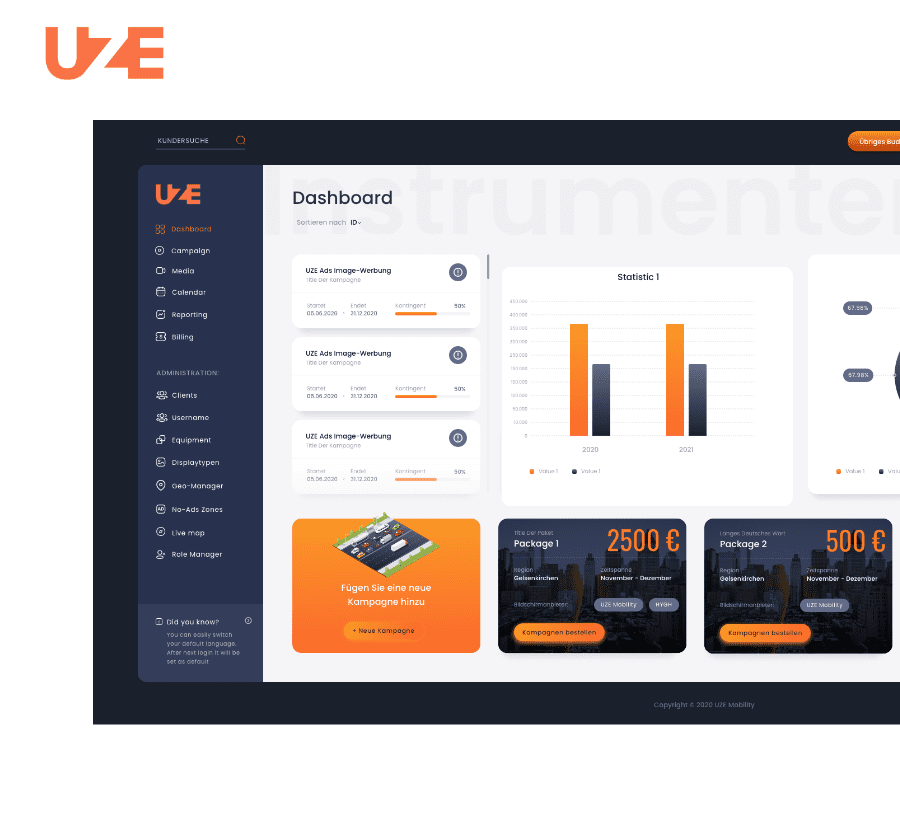
We managed to create a modern-looking UI that is easy to understand and navigate for anyone, regardless of their technical skill. We built a dedicated unique design from the ground up, which allowed us to adjust to requirements more than any out-of-the-box theme would. We redesigned the main dashboard, allowing users to see all their campaigns and their progress in one place. We managed to keep the UI intuitive while preserving the users’ ability to take advantage of all the benefits of a complex system. We included a wizard that guides users step-by-step through the booking process.
Crucially, we also focused on maintaining high performance in the event of the inevitable growth of users and display devices. Equally importantly, we made sure the software was easy to maintain, allowing for it to be updated and extended with new features in the future.
07.
The future
We will continue our cooperation, expanding from the client-side UI to the administrative panel. Our plans include adding support for stationary advertising, redesigning the campaign calendar, adding an administration panel for cooperation with third-party partners, new sign-up and log-in options, and redesigning the media choice flow. We are not done – we will continue adding more functionalities and improving the flow to bring even more value to UZE’s clients.
Full article
Read the detailed description of the case study available on our blog.