A silent barrier is blocking conversions on your platform, and it’s built into the design itself. While you’re A/B testing hero images and CTAs, your ticketing platform may quietly exclude one of the 87 million Europeans with disabilities. Not because they’re uninterested, but because they can’t.
“Have you ever tried buying tickets with your eyes closed?
“I tried everything. Tabbing, navigation shortcuts, restarting the process, and was completely stuck,” said one user who found an invisible button during checkout. “This essentially broke the site’s core functionality, the ability to buy tickets.”
This isn’t just one frustrated customer. It’s a pattern of preventable barriers.
I spent time looking through real user stories from disabled people across Europe. I used those stories to understand where people get stuck and what platforms can do to fix it.
The results aren’t one-off rants, they’re real stories. They show exactly where users drop off and why.
What you can learn about missed revenue and lost trust
“I had to go to a Reddit thread just to figure out how to book a wheelchair-accessible ticket.”
I explored comments on social media using hashtags like #Usability, #CheckoutIssue, #Accessibility, #Socioeconomic, and #Emotion. Posts from Reddit, X (Twitter) & Facebook showed clear repeated patterns. Users were trying to buy tickets across Europe and often walking away empty-handed.
“I couldn’t buy my ticket without help. That’s the opposite of accessibility.”
Accessibility failures create more engagement than pricing issues. These stories don’t fade, they spread. Words like “scam,” “rip-off,” and “hopeless” appear over countless 1-star reviews. That’s lost business and long-term brand damage.
Building accessibility into your Event Ticketing Software is the right thing to do & it drives results. When users can book tickets independently, conversion rates rise. And it’s not just one ticket at stake. On average, each disabled customer brings 1.6 companions. When one person can’t buy, the entire group walks away.
Accessibility issues will affect user emotions. After a bad experience, 71% of people felt frustration, 58% disappointment, and 24% anger. These negative experiences damage brand perception and loyalty. And with the European Accessibility Act taking effect in June 2025, you have a deadline. Now is a good time to think about how an accessibility audit can help.
What is the EAA?

The European Accessibility Act (EAA) is a new law from the EU. Businesses need to make digital products and services accessible to individuals with disabilities. For example, mobile and web platforms must be compatible with screen readers. Alternative text for non-text content and extra keyboard navigation are just some examples. EU countries had to adopt the EAA into national laws by June 28, 2022. Companies must follow these accessibility rules by June 28, 2025.
Four strategies to inclusive ticketing
Ready to plug those conversion leaks? Let’s explore four crucial areas of your system and identify impactful fixes to boost performance.
Strategy 1: making discovery easier
“I just want to find events I can actually attend.”
When a UK wheelchair user wanted to select an “Ambulant” ticket, they found “There is no option to do so.” That’s not a UX issue. That’s revenue walking out the door before checkout even begins.
Users with disabilities often face barriers when trying to buy tickets. After having a problem, 51% of users will look for alternative accessible options & 42% will stop using the brand’s services.
Key issues:
- No clear filters for accessibility options
- Inconsistent language localization
- Fragmented regional platforms
Strategic fixes:
- Add clear accessibility filters. These should include “Wheelchair Accessible,” “Audio Described,” and “Sign Language Interpreted”. Platforms with these filters see up to 22% higher engagement.
- Create a cross-region search. Automatic language detection and cross-domain searches work with geographical preferences.
- Optimize for screen readers. The proper use of ARIA landmarks and clear headings is essential for users with visual impairments. They let technology find key areas like search and filters. Accessibility audits show that 64% of major platforms have poor heading structures.
Strategy 2: confident consideration
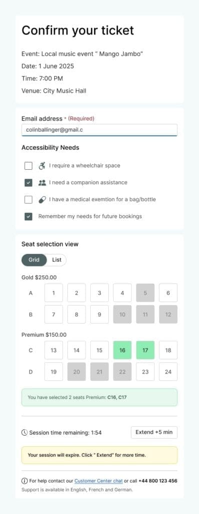
“Why is this seat labeled accessible but has no view?”
You’ve worked hard to get clients to your event page. Now you’re losing them with hidden fees & buried accessibility information. On top of this, you have seat maps that might as well be hieroglyphics for keyboard users.
“I clicked a seat marked as accessible, but it turned out to be behind a speaker. Zero view.”
Even when accessible seating is available, it often doesn’t match standard seating. Disabled attendees feel disappointed when placed in poor viewing areas, separated from friends.
Key issues:
- Hidden fees or difficult pricing
- Unclear or buried accessibility info
- Poorly labeled accessible seats
Strategic fixes:
- Put in place pricing transparency. “Knowing you’re gonna pay €300 up front is better than it being advertised at €50 then…having fees piled on”, as one user put it. A/B tests show 7-12% higher conversion when pricing is upfront. This transparency benefits users who need more time to think about buying.
- Create accessibility information modules. Create a standardized & clearly labeled accessibility section. The best examples use both icons and detailed descriptions in expandable sections. This works for quick scanners and detail seekers.
- Offer dual seat selection views. Your interactive seat map might look impressive, but can someone navigate it without a mouse? Use both visual maps and keyboard-accessible list views. 24% of users find that companies don’t provide keyboard navigation.
Can your customers navigate without a mouse?
That fancy seat selector with drag-and-drop functionality? It might win design awards, but for users with mobility impairments who rely on keyboards, it’s a conversion killer in disguise.
“There was simply no way to proceed beyond the insurance pitch using only a keyboard,” reported one user. The research shows that 38% of critical checkout elements fail basic keyboard accessibility tests. This directly impacts approximately 4% of your audience.
Strategy 3: checkout optimization that works
“It timed out before my screen reader could finish.”
This is where the money walks away. 62% of users would switch to a different company after facing accessibility challenges.
“The ‘Decline Insurance’ button wasn’t visible to my screen reader. I couldn’t buy the ticket without help.”
When a screen reader user encounters an unlabeled button, or a customer can’t complete a form because of a timer, that’s 100% conversion loss.
Key issues:
- Countdown timers incompatible with assistive tech
- Unlabeled or non-focusable buttons
- Complex form layouts without clear error states
Strategic fixes:
- Add adaptive checkout timers. The countdown that creates urgency also creates anxiety and abandoned carts. Issues will leave 89% of users frustrated. 45% will describe their experience as extremely or very frustrating, and 44% as somewhat frustrating.
- Make sure all interactive elements are properly labeled. Every button, form field, and interactive element needs ARIA attributes and keyboard support. This isn’t just accessibility, it’s basic functionality for a large part of the end-users.
Example:
Use role="button" and aria-label="Accessible Seating - Section A, Row 1" for seat elements.- Create linear, logical form layouts. Multi-column checkout forms might look good in mockups, but they’re hard to use with a screen reader, and they hurt conversions. Keep the form simple and linear, with clear error messages that screen readers can detect and announce.
“It timed out before my screen reader could finish”
Picture a motivated buyer, credit card in hand, ready to purchase, but they can’t find the “Complete Purchase” button. This is because it’s invisible to their screen reader. For approximately 2-3% of your audience, this is their daily reality.
One Welsh customer watched helplessly as a large ticketing platform’s checkout timer ran out before he could buy it. The sale only happened because a friend helped. Are you testing your checkout with screen readers? If not, you’re essentially placing a “Not Welcome” sign on your digital door for millions of potential customers.
Strategy 4: post-purchase support
“No ticket. No support. Now what?”
You got the sale. Now, don’t waste the relationship. 79% of people are put off buying tickets due to problems booking. That’s an expensive way to lose customers you’ve already acquired.
“No ticket. No support. Just stress.” That’s how users describe the post-purchase experience when things go wrong.
Key issues:
- Lost confirmation emails with no way to recover
- Inaccessible digital tickets
- One-size-fits-all customer support that doesn’t fit anyone
Strategic fixes:
- Create accessibility preference profiles. Allow users to store accessibility needs once and apply them in the future.
- Ensure digital tickets work with assistive technology. Your QR code ticket is useless if it can’t work with screen readers or zoom features. 41% of digital ticket platforms have accessibility issues with screen readers or magnification tools.
- Provide multi-channel support options. Phone-only support disadvantages deaf users. While chat-only support can frustrate people with certain cognitive disabilities. A multi-channel approach increases satisfaction scores by 27% among users with diverse needs.
- Put in place email recovery systems. Create a multi-layered approach to email confirmation issues:
- Verify email with a confirmation step before final sale
- Send confirmation to both email and phone (SMS) when possible
- Create a ticket lookup tool using order ID and last name/phone
- Use browser storage as backup for digital tickets in case email fails
- Automatically detect bounced emails and trigger customer outreach
Why does this matter?
This isn’t about edge cases or theoretical UX debates. The research shows real people telling you where your platform is falling short. These are their stories, their barriers, and dropped conversions.
I scrolled through social media to find real user feedback and spot the most common issues. Most of the stories highlight what happens when things go wrong. As we all know, people are more likely to report a bad experience. But that makes the feedback even more important. These are moments where you lost conversions and trust broke down.
If you’re responsible for a ticketing platform, now is the time to act.
- Test your platform with screen readers and keyboards only
- Put in place structured accessibility reviews at every phase
- Track drop-off rates by user needs and start improving from there
Let your users’ voices guide your next product decision. Their stories aren’t complaints, they’re a roadmap to better business.